
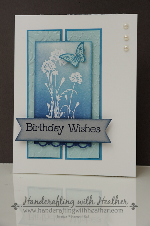
I have an elegant card for you today that features the Serene Silhouettes stamp set (wood mount and clear mount) from Stampin’ Up! Recently I have seen several projects that used a resist technique with beautiful results, so I decided to try it out for myself. I think the white embossing of the flower image is just lovely! If you agree, I would love to hear from you. Please leave me a comment and I will enter you into my drawing. During the month of April, I will be doing a drawing each Sunday. One lucky winner will receive one of the featured products from Sale-a-bration. So, if you missed out on the free items during the sale, now is your chance to win one! Also, if you enjoy reading my posts, why not have them delivered to your inbox automatically. Just click on the “follow” button in the sidebar.
Today’s project is inspired by three different challenges: Retro Sketches #108, Splitcoast Stampers CAS266, and The Card Concept #7.

I began my card with a Whisper White card base. Then I cut panels of Marina Mist and Soft Sky. I used my Big Shot to emboss the Soft Sky panels with the Beautifully Baroque and Fancy Fan embossing folders. I layered the Soft Sky panels on the Marina Mist ones and adhered them to the card base using Multipurpose Liquid Glue.

Next, it was time to turn my attention to my focal piece for the card. I began by rubbing a panel of Whisper White card stock with my Embossing Buddy to ensure that I got a clean image without any extra embossing powder stuck on the card. Then I inked up my stamp with Versamark Ink and coated the image with White Stampin’ Emboss Powder. I used my Heat Emboss Tool to set the image.
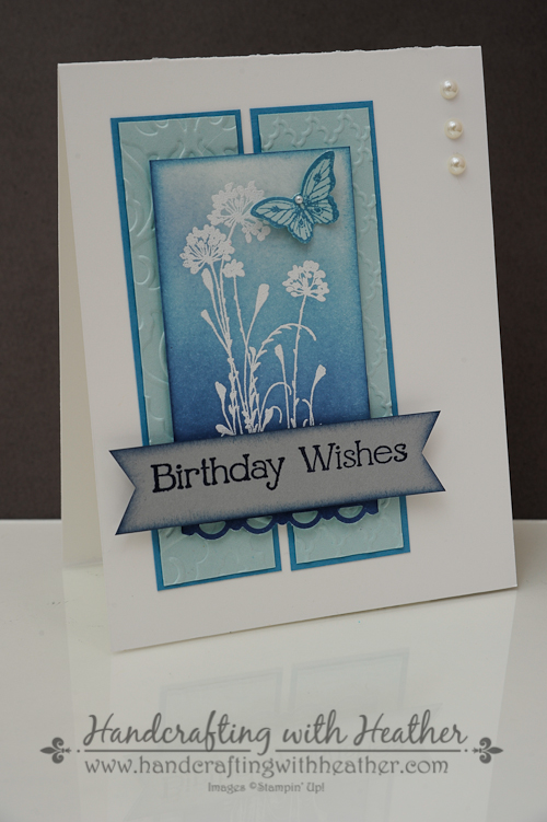
At this stage of the game, things were looking rather plain, but that was all about to change. The next steps are where the magic happens. I used a sponge dauber to add ink to the background of my image. I began by adding Soft Sky ink to the entire background using a circular motion. Then I started from the bottom of the panel and added Marina Mist ink, blending it with the Soft Sky as I went. I followed the same procedure with my Night of Navy Classic Stampin’ Pad next. I kept layering and blending until I achieved the desired ombre effect.

I finished my art piece by adding a butterfly from the Papillon Potpourri stamp set (wood mount and clear mount). I stamped the image in Marina Mist ink on Soft Sky card stock and punched it out using the Bitty Butterfly Punch. I embellished the butterfly with a Basic Pearl Accent and attached it to the panel using a Mini Glue Dot. Next, I punched the bottom of the panel using my Scallop Trim Border Punch and attached it to the front of the card with Stampin’ Dimensionals.

For my greeting , I chose the “Birthday Wishes” sentiment from the Four You stamp set (wood mount and clear mount). I stamped it in Night of Navy ink on a scrap of Smoky Slate card stock. Then I used my Hexagon Punch to create the ends of my banner. Next, I used a sponge dauber to ink around the edges of the panel with Marina Mist ink. I mounted my sentiment onto the front of the card using Stampin’ Dimensionals. Finally, I added three pearls to the top right corner of the card.

For the finishing touches on the inside of my card I stamped the floral image from the Serene Silhouettes stamp set in the corner using my Night of Navy Classic Stampin’ Pad.
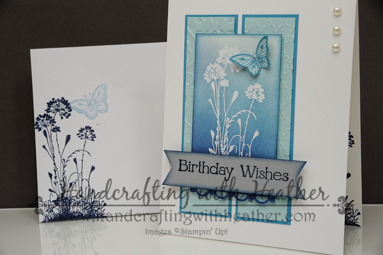
As a final detail, I stamped the images from the card on an envelope too. I love the crisp look of the blue tones on the white card. It just looks clean and elegant. I would love to hear what you think about this project too. Don’t forget to leave me a comment, for your chance to win a free stamp set! Also, if you liked my post today, please pin it to Pinterest for me. If you scroll to the bottom of the post, you will find a “pin it” button just below my supply list for the project.
If you would like to purchase the Serene Silhouettes stamp set you can shop in my online store now by clicking here. If you need any stamping supplies, I hope you will consider contacting me to be your demonstrator. I would love to create with you!
You can find a complete list of supplies used for this project at the very bottom of this post.
____________________________________________________________
WEEKLY DEALS from Stampin’ Up! April 1-7
Click here to see the Weekly Deals from Stampin’ Up! in my online store. The Weekly Deals are only while supplies last and only available at these great prices through April 7.

________________________________________________________________________________________
If you need any stamping supplies, I’d be very happy to be your Demonstrator. Just click on Order Stampin’ Up! Online Now in the main menu or in the sidebar to go directly to my online store or drop me an email if you have any questions.
Happy Stamping!
Heather
____________________________________________________________
Stampin’ Up! items used to create this project:
Stamp Sets: Four You (130538); Serene Silhouettes (127324); Papillon Potpourri (123759)
Dies, Punches, & Embossing Folders: Beautifully Baroque Textured Impressions Embossing Folder (130917); Fancy Fan TIEF (127751); Bitty Butterfly Punch (129406); Hexagon Punch (130919); Scallop Trim Border Punch (118402)
Card Stock & DSP: Whisper White (100730) – 4-1/4″ x 11″ card base; 2″ x 3-3/4″ panel; Marina Mist (119682) – 1-1/4″ x 4-1/2″ (2 panels); Soft Sky (131203) – 1-1/8″ x 4-3/8″ (2 panels), one butterfly punch; Smoky Slate (131202) – Banner for sentiment.
Markers & Ink: Soft Sky Classic Stampin’ Pad (131181); Marina Mist Classic Stampin’ Pad (126962); Night of Navy Classic Stampin’ Pad (126970); Versamark Ink (102283)
Embellishments: White Stampin’ Emboss Powder (109132); Basic Pearls Jewel Accents (119247)
Tools: sponge daubers (102892); Big Shot (113439); Heat Emboss Tool (129053); Embossing Buddy (103083)
Adhesive: Stampin’ Dimensionals (104430); Glue Dots (103683); Multipurpose liquid glue (110755)


This is simply beautiful! Thanks for sharing your talents with us!
LikeLiked by 1 person
I agree, just beautiful!! Love the shades of blue.
LikeLike
Beautiful..how did you not get any of the blue background ink from covering the white embossed flower? And the reverse design inside is just magically.
LikeLike
The embossing acts as a resist. The ink really doesn’t stick to it much. When I was all finished I wiped the design with a paper towel to get off the little bit of ink that was there. It is a pretty cool technique! Give it a try and let me know how yours turns out!
LikeLike
All of these articles have saved me a lot of hedeachas.
LikeLike
Really love your card Heather, the shades of blue are gorgeous. The additional stamping inside the card and on the envelope is great too. I am behind you in Card Concept #25 Cx
LikeLike
Lovely, I like the extra touch of the pearls.
LikeLike
Gorgeous card. Love the layout and think it would also be pretty in other color combinations. I’m with Caroll–wondering does the blue not stick to the white embossed images?
LikeLike
This is a gorgeous card. Love it.
LikeLike
just signed up for your emails–i am so glad to have foud your very elegant cards–thanks for sharing–love the details about making the cards!!
LikeLike
I’m glad you found me too! Thanks for subscribing. I post cards three days each week.
LikeLike
This is a very stunning card. It’s been a while since I’ve done this technique…May hafta revisit it.
LikeLike
Wow, you’ve created such a SERENE card here! I absolutely LOVE it! The blues are beautiful against the embossed image and I love the way you stamped on the inside. Great butterfly, too!
LikeLike
Beautiful card. I love how you used the two separate embossing folders!
LikeLike
Just beautiful. Love the colors and layout. I hope you don’t mind if I case your idea for a class later this month.
LikeLike
Patti, check back in tomorrow. I’ve created a stamp a stack set around this card design. Feel free to case my designs, but please let your customers know the inspiration came from Handcrafting with Heather.
LikeLike
Lovely card Heather. I always forget about marina mist and how pretty it is.
LikeLike
Love this card, so stunning.
LikeLike
Heather – I just found your site. I love this card! Very elegant. Actually, I love all four cards you made. Marina Mist is my new favorite color. (Well, after melon mambo!)
LikeLike
So pretty..love the blues. Thanks for joining us at The Card Concept.
LikeLike
Gorgeous card! LOve the colors, the stamps – everything!!
LikeLike
Very classy card, I love all the different shades of blue you used to create your card Heather.
LikeLike